Thursday, April 9, 2009
Lab 9
In lab 9 we used Google sketch up to create 3d models of 3 different buildings at Mason. I find it difficult to learn how all of the tools work together within a week, but now at least I have enough knowledge of how it works to be able to expand upon it.

Wednesday, April 1, 2009
Monday, March 30, 2009
3D Mapping and Modeling
3D mapping uses depth as a visual variable to illustrate a phenomena. This can be used in representing elevation and the earth's surface (think Google Earth), or can be used in thematic mapping. Here are a few examples:
(click on the picture to view the map source)
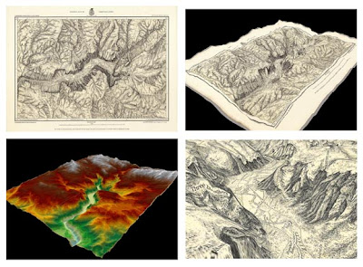 In this interactive example historical maps are brought to life using DEM (digital elevation models) and 3D GIS modeling to add depth and realism to the mapped geographical area. On this website you'll find 4 different examples that bring these 1800's maps to life. This example of modeling also allows the user to change the perspective of the map, analyzing it from every angle.
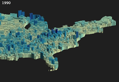
This map is showing civilian labor force unemployment in 1990. While the effect of the 3D mapping is dynamic on this map, I think the angle at which the map is displayed makes it difficult, however to see the full aspect of the map. You are able to identify the areas of highly concentrated unemployment, but not specific locations or values.

This map is an example of a 3D map illustrating the elevation in a park. I think this is a better way to use 3D effects than in the first example. This is one of the first and most common uses of 3D mapping and modeling. The color ramp in this map, where the lighter colors are used to show higher elevation, is a typically used color scheme.
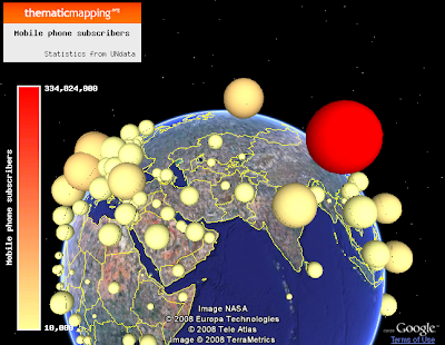 This map is an example of using volume symbols in thematic mapping. Volume symbols use the height as a visual variable to illustrate the different values within the phenomena being mapped. In this example the symbols were placed onto google earth. The thematic mapping engine, is an online mapping tool which allows users to create maps using volume symbols.
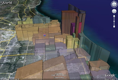
This 3D mapping example uses Google earth and sketch up to illustrate median household incomes in Chicago. This map is very clean, and allows the user to easily understand the geographical context, as well as the phenomena being mapped. There is a good use of color in this map that allows the audience to fairly accurately interpret the values while comparing them with each other. Similar to previous examples, this map doesn't provide the user with any specific values.
(click on the picture to view the map source)
Illustrating a Map to 3D
In this interactive example historical maps are brought to life using DEM (digital elevation models) and 3D GIS modeling to add depth and realism to the mapped geographical area. On this website you'll find 4 different examples that bring these 1800's maps to life. This example of modeling also allows the user to change the perspective of the map, analyzing it from every angle.Choropleth Map
This map is showing civilian labor force unemployment in 1990. While the effect of the 3D mapping is dynamic on this map, I think the angle at which the map is displayed makes it difficult, however to see the full aspect of the map. You are able to identify the areas of highly concentrated unemployment, but not specific locations or values.
Isoline Map

This map is an example of a 3D map illustrating the elevation in a park. I think this is a better way to use 3D effects than in the first example. This is one of the first and most common uses of 3D mapping and modeling. The color ramp in this map, where the lighter colors are used to show higher elevation, is a typically used color scheme.
Proportional Symbol Map
This map is an example of using volume symbols in thematic mapping. Volume symbols use the height as a visual variable to illustrate the different values within the phenomena being mapped. In this example the symbols were placed onto google earth. The thematic mapping engine, is an online mapping tool which allows users to create maps using volume symbols.Choropleth Map
This 3D mapping example uses Google earth and sketch up to illustrate median household incomes in Chicago. This map is very clean, and allows the user to easily understand the geographical context, as well as the phenomena being mapped. There is a good use of color in this map that allows the audience to fairly accurately interpret the values while comparing them with each other. Similar to previous examples, this map doesn't provide the user with any specific values.
Thursday, March 19, 2009
Thursday, March 5, 2009
Lab 5: A Work In Progress
My lab 5 is definitely still a work in progress. I still want to tweek the graphics and base map a bit, although I am happy with my army icons. I used AI to illustrate the basemap, which accordingto adobe should transfer over without a problem--but alas, it crashes flash everytime. So, in the next week in addition to adding what we need to for Lab 6 the basics of my map need to be spruced up. I am also going to change the timeline around because I think 12sec=1 day is a bit slow, but where I have it now is too fast.
I also have had to sidestep the instructions because I don't have CS4, so I don't have the fancy motion editor like in the SOP.
I foresee myself spending a fair amount of time on this over spring break--in order to get results I am happy with.
I also have had to sidestep the instructions because I don't have CS4, so I don't have the fancy motion editor like in the SOP.
I foresee myself spending a fair amount of time on this over spring break--in order to get results I am happy with.
Wednesday, February 25, 2009
Democratic Elections: Lab 4
Lab 4
In this lab we created a "faux-GIS" interface that allows a user to layer different versions of a map and information on top of one another. This lab was particulary difficult, although the importance of accuracy when naming layers/symbols is continually stressed. The most challenging part is getting the action script written correctly. I wish that I had been able to insert text boxes or roll over boxes for each year that would contain general election information (canidates and winner). I struggled with this for a while, but with limited knowledge of action script I couldn't incoorperate this without applying the 20% alpha to the text box/information graphic while allowing the check box to turn this information on and off with the map.
In this lab we created a "faux-GIS" interface that allows a user to layer different versions of a map and information on top of one another. This lab was particulary difficult, although the importance of accuracy when naming layers/symbols is continually stressed. The most challenging part is getting the action script written correctly. I wish that I had been able to insert text boxes or roll over boxes for each year that would contain general election information (canidates and winner). I struggled with this for a while, but with limited knowledge of action script I couldn't incoorperate this without applying the 20% alpha to the text box/information graphic while allowing the check box to turn this information on and off with the map.
Subscribe to:
Posts (Atom)